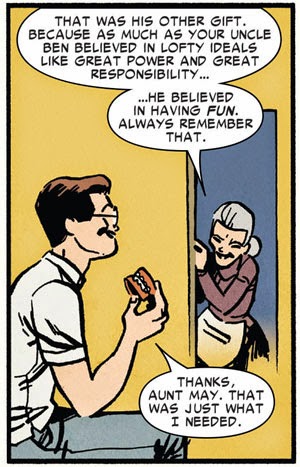

Saturday, May 06, 2006
Friday, May 05, 2006
Stop! Hammer Time! (or, Leggo Mjolnir 2: Electric Boogaloo)
Jeepers, Mister Thor! Looks like everybody wants to get their hands on your hammer. You're kinda grabby with that thing. Maybe someone needs to learn a lesson or two about sharing, hmm?


About that last cover: in an earlier post, Bombastic Bully Brigade member Chuck T. wrote:
Sooooo...Mister Thor...can little stuffed bulls lift your mighty hammer? If so, may I jus' hold it while you play Frisbee with Iron Man in the park, 'kay? I will take very good care of it.
(More Ten of a Kind here.)
I've been trying to figure this out for years: can robots lift Thor's hammer? What about sentient ones like Ultron or the Vision?If I 'member my early eighties Thor mythology correctly, Gabriel the Air-Walker (the "Death Angel" of this cover and former herald of Galactus) was a robot. I don't 'member the exact circumstances, but yeah, assuming that it isn't a case of "this scene does not occur in this comic!," it looks like robots can lift Mjolnir. Unless, of course, they can't in other stories written by other writers.
Sooooo...Mister Thor...can little stuffed bulls lift your mighty hammer? If so, may I jus' hold it while you play Frisbee with Iron Man in the park, 'kay? I will take very good care of it.
(More Ten of a Kind here.)
Thursday, May 04, 2006
Ben Grimm Totally Rocks! Reason #11
Why does Ben Grimm totally rock?

11. He can speak his own classic team logo in a word balloon.
Even in black wrasslin' shorts and cute li'l booties, he knows how to rock typography to its fullest effect. Leaving the FF, Mister Grimm? Maybe now you can team up with uber-designer Chip Kidd! And now you know...another reason why Ben Grimm totally rocks.
(Reason #1-3 • 4 • 5 • 6 • 7 • 8 • 9 • 10 )
Wednesday, May 03, 2006
The World's Greatest Comic Magazine Logo!
(Ten days late and ten dollars short, as Mama Bull used to scold me. I hope you'll enjoy it and think it was worth the wait:)
I love the Fantastic Four logo.
Not this:

(which is a pretty dandy piece of design work that still works visually no matter which artist is drawing Mister Fantastic or the Invisible Woman), but rather the masthead logo for their comic book:

How much do I love it? So much that I had to save up my weekly dimes to buy Comicraft's font version of that typography, the aptly-named Thingamajig. I've used it for lotsa things—no pun intended—including creating my entry in Pal Dorian's blogosphere-devouring "Just Remember" meme:

I'm a bull who loves his fonts, even when that's not the main thing to be appreciated about an object of my bullishness. A major part of my absolute obsession with the London Underground is my utter admiration for the sheer elegance and clarity of the oh-so-classic Johnston Underground font. Likewise, I love the space and time-spanning adventures, and the bickering family dynamic, and the big bold brassy artwork of Mister Jack Kirby and Kirby-followers, and especially I love Ben Grimm, but I also love the FF logo. The typography of the Fantastic Four masthead just fills me with a warm, familiar cozy feeling of the sort you normally only get by sipping hot chocolate with mini-marshmallows on a cold snowy winter day.
But if you examine it closely enough, it's sorta inelegant. It's hampered by the basic problem that the phrase "Fantastic Four"—one long word, one short word—is a little difficult to position boldly at the top of a comic cover without leaving a chunka white (or red, or bold Kirby orange) off to one side. I'm sure that at one time or another cover artists have cursed the FF logo as one of the most difficult to work with: it's got a few too many characters to work boldly as one line, but putting the phrase on two lines makes it difficult to break down into a single solid block they can draw around.
Consider this: one of the many innovations that Marvel Comics introduced to the medium in 1961 and beyond is the adjective on the front cover of their books: The Amazing Spider-Man. The Mighty Avengers. The Incredible Hulk. The Invincible Iron-Man. The Mighty Thor. The Uncanny X-Men. Of the early Marvel books, only a handful escaped adjectives: Captain America, Dr. Strange, Sgt. Fury. (Daredevil got the extreme end of the Stan Lee verbosity stick: for years its logo read Here Comes Daredevil, The Man Without Fear! Now there's a logo that invites examination...but not in this post!)
These adjectives were often part of the official title of the books, but not often used to talk about the book itself (at least until multiple titles featuring the same character premiered, either featuring a different adjective or leaving it off altogether). But the FF never could drop their adjective. You could call Bruce Banner the Hulk without the "Incredible," you could shout "Avengers Assemble!" and leave off the "Mighty." But you can't call Dr. Richards and associates "The Four." Call 'em the FF for short, but their comic book has to shout their adjective as big or bigger than the "Four." And that gives birth to a weirdly '60s, kinda lopsided, quirky but powerfully fitting logo on the cover of issue #1 (cover-dated November 1961):

The comic set the world on fire, and comic books have never been the same again. And that logo? As familiar as the most recent FF issue on thenewsstand comic book store shelf. The Fantastic Four: created by Stan Lee and Jack Kirby! But don't forget that logo, created by Sol Brodsky. It was so popular (the book, not necessarily the logo) that Marvel's monster anthology comic Amazing Adult Fantasy was given the same typography with issue #7 (cover dated December 1961):

A couple internet FF historians disagree on the exact sequence of these events:
Ha! Caught you out in your silly mistake! The FF logo (and its various surrounding elements) evolved, changed, and for several stretches of several years went away altogether. Just like Ben Grimm's appearance varied from year to year, mild and major changes to the FF logo are part of its history—let's trip through the years through the magic of Doctor Doom's time machine (and through comics covers I've gathered from the always-indispensable Grand Comic Book Database) and track the FF's ever changing-logo:
FF #4 (May 1962): Not merely the Silver Age debut of The Sub-Mariner and the weirdest shave ever shown in comics, but also of Fantastic Four's hyperbolic Stan-ism of a catchphrase reading line: The World's Greatest Cover Magazine!:

FF #14 (May 1963): The logo shrinks and slides slightly to the side to make room for the very-long-running feature of the Marvel corner box (and isn't that a photographic-lookin' Thing in that box?):

FF #16 (July 1963): two months later, a very subtle change to the logo but one which opens it up to being slightly enlarged: the off-center "The" of the title disappears completely:

FF Annual #1 (1963): On Marvel's first annual, the letters of the logo are each colored differently, giving this special oversized issue a festive and circus-type atmosphere:

(The multicolored logos were done across the Marvel line for Annuals, and were repeated the following year):

FF #42 (September 1965): 'Member this? My favorite corner box period of all time, the "Marvel Pop Art" logo. It didn't last long (it was gone by issue #46), but golly, they need to revive that!:

FF #95 (February 1970): In the last year of Kirby's reign on FF, the logo gets a chunky makeover:

FF #116 (November 1971): The debut of the long-running, line-identifying "Marvel Comics Group" banner at the top of all their comics. This month also debuted a much more dramatic change in the design of all Marvel's covers, the box cover format (click here for a view of FF #116's full cover), which reduced the artwork size on the cover. (Always-knowledgeable comics guru Mark Evanier writes about the decision behind this change—and the swift change back in less than a year—here.) But still, that logo's identifiable and recognizable. Nothin's gonna change that, right?:

FF #119: (February 1972) Yikes.
I dunno know what to say about this FF logo. It's bigger. It's bolder. It makes better use of space than the original logo. But it's jus' not...I dunno, it's jus' not the Fantastic Four. (And it appears that the cover colorist didn't know quite what to do with it...note the miscolored space in the first "F". This was corrected on later issues, but golly, it just all seems to be a nondistinct logo that wouldn't have been out of place at Charlton or even DC but hardly seems bold and individual enough for the flagship of Marvel's line. I know that's just plain bullish opinion, but...well, it couldn't get worse, could it?

FF #160 (September 1975) Double yikes.
Okay, I was jus' plain polite about the logo above, but boy howdy, this one was a stinker. I'm not expert on typography, but those letters don't even seem to go with each other. (That "C" and "U" seem oddly curvy, and the "O" looks too wide to my untrained little button eyes.) I do kinda like those big character pictures, but not at the expense of a good logo. I don't know much about art, but I know what I like, and this ain't it:

Marvel's Greatest Comics #80 (November 1978): Even when Marvel's reprint series Marvel's Greatest Comics switched their logo to a FF variation, they went back to the 1972 variation:

FF #218 (May 1980): But fear no more, true believers. Like Ben Grimm always reverting back to The Thing, the classic logo reappeared suddenly in the early 1980s, for the first time in eight years:

FF #222 (September 1980): But things were gonna get a little worse for cover design at periodic times over the next year, as Marvel Comics occasionally sold off their top banner into chunky, obnoxious ads that must have had the cover artists cursing the very name of Jim Shooter. Really, remember how this banner blasted across the cover of X-Men #137? Sure, Phoenix Must Die, but you could win $2500! I bet that was a comfort to Mister Cyclops, huh? (And note how "The World's Greatest Comics Magazine" gets shuffled to a tiny bottom of the corner box!)

FF #235 (October 1981): At last! Back to the basics of cover design, with a new tweak: John Byrne, just beginning his long run on the book, redesigns the corner box to include his versions of the characters:

FF #236 (November 1981): But a month later, the corner box (temporarily) disappears for the book's twentieth anniversary, and the classic logo debuts its first-ever one-line design: a little chunkier, but allowing Byrne to fill the page with a bazillion FF characters (including Stan, but no Jack—Byrne had included Jack but he was cut out by Marvel management due to then-current legal battles between Kirby and Marvel. Boo, Marvel!):

FF #238 (January 1982): The one-line logo helps out a bit when the obnoxious fat ad banners temporarily appear:

FF Roast One-Shot (May 1982): An unusual use of the one-line logo on Fred Hembeck's silly but fun anniversary "roast" of the FF. It's interesting but odd to see other words in the FF "font": the other letters in "Roast" are taken from the original logo, but that "R" looks a little odd, don't it? (Note the fun variation on the above-the-title reading line!):

FF #252 (March 1983): Whoa! Who tilted my comic book?!? John Byrne went widescreen for this oddball issue of FF, in which the cover and story pages were completely turned on their side. It's a stunt that's been done a few times before (Hello, Dave Sim!) and since then (I'm lookin' at you, Rob Liefeld!) but this was a fun and quirky stunt that was really innovative for Marvel at the time. I 'specially liked that a few issues later, the letters page commenting on this issue was also turned on its side:

FF #259 (October 1983): This musta been a dream come true to Marvel comics artists: for the first time in 12 years, the "Marvel Comics Group" banner disappears and is replaced by a small "Marvel" logo in the corner box. Almost immediately this gave cover artists a slim but perceptibly larger art area to work with:

FF #265 (April 1984): Not a logo change but one of my favorite corner boxes of Marvel history, so I had to include it. Who's the newest member of the FF (replacing the Secret Wars-lost Ben Grimm)? John Byrne's not telling you in the corner box, not just yet!:

FF #266 (May 1984): Oh, it's the She-Hulk. Okay, that's cool:

FF Annual #18 (1984): All logos of Marvel's 1984 annuals featured the word "Annual" in the same typography as the title. This is a little more successful than the "FF Roast" logo; the letters look more flowing and natural and specifically designed for the occasion and kern well together. A nice touch.

FF #270 (September 1984): Logo-smashing by villains is a tried-and-true shorthand to show you just how earth-shattering their evil plots are! It's surprising it took 23 years for the FF logo to be ripped asunder by a villain (in this case, Galactus-wannabe Terminus). I like how widely the letters are scattered—they are nearly halfway down the cover!:

FF #282 (September 1985): One year later, here's another weird logo treatment. It's not quite an infinity cover, but as the FF disappear into multiple dimensions, so does their logo. Sadly, it's a Secret Wars II tie-in:

Fantastic Four versus the X-Men #1 (February 1987): But the FF's classic logo does pose some problems—it's hard to imagine it working with the big blocky X-Men logo on the 1987 team-up miniseries. Still, that kinda-generic FF logo does Marvel's First Family a disservice. (And I betcha if this book was published today, it'd be called X-Men vs. Fantastic Four!)

FF #308 (November 1987): The team members change, and so does the corner box. Incidentally, now that "Fasaud" has become such a major player and key villain in the Marvel Universe, isn't it fun to see where he got his humble start as the Sensational New Character Find of 1987?

FF #327 (June 1989): ...but it's not as weird as this corner box from a year and a half later with five members!:

FF #369 (October 1992): The nineties are here! The nineties are here! How can you tell? Because Wolverine and Ghost Rider star guest-starring in everything! Seriously, this handful of "New FF" issues with temporary team members were kinda fun. Ya gotta love the revised "World's Greatest..." line!:

FF #369 (October 1992): Golly, Miss Malice! Careful with that classic logo...oh, there you've gone and smashed it. As Mama Bull would say "We can't have nice things!" I bet your brother would take better care of his logo.

FF #371 (December 1992): Whoops, maybe not. Hey, careful there, Mister Melty! Why's this cover look so drab? It was actually an embossed cardboard cover. Doesn't really work online, does it? (Especially since the logo was being warped). That's okay, it didn't really work on the comic book store shelf either:

FF #374 (March 1993): Weird generic logo for the "new" FF pits it against the old logo. Not a bad idea by itself, but I gotta ask: why put the classic logo at the bottom? It's almost as if Marvel didn't care for the legacy of the logo:

FF #382 (November 1993): Nope, maybe not...cos they next thing they were doing was scribblin' all over it! I like the concept of a changed logo if the FF grows or shrinks, but this slapdash graffiti scrawl approach signaled a long stretch of kinda-uninspired, mean-spirited and badly-nineties-cliched FF stories:

Marvel Action Hour #1 (November 1994): Coinciding with the new FF animated cartoon, Marvel published a new FF comic in the style of the cartoon. Without the style and grace of the animated-version Batman Adventures comic over at DC, this comic didn't last long, so we didn't have to put up with this supposedly-modern yet inelegant and clunky logo updating:

FF #396 (January 1995): More smashiness:

FF: Atlantis Rising #1 (June 1995): Whoa, here's a book and a logo I've never seen before. It's a two-issue FF miniseries. It's about as far as you can get from the classic logo, but I kinda like this one: classical and aquarian; kinda Greek-temple looking in that Sub-Mariner way. The "4" symbol superimposed on the Marvel corner "M" is a nice design touch:

FF: Unplugged #2 (September 1995): A misbegotten logo from a misbegotten series that summed up a lot of what was wrong with Marvel in the mid-nineties: attempts at reimagining and reinventing their characters without the grace or charm of the originals. I've never been a big fan of substituting the numeral "4" for the word "Four" in the FF logo. It seems to violate some basic unwritten rule of typography, I guess—for clarity, spell out words in titles and headlines. Maybe I'm being too picky. Even ignoring that quibble, the typography in "Unplugged" doesn't match or more important, even harmonize with the rest. A best-forgotten version of the classic logo:

FF 2099 #2 (January 1996): Oh my, it just gets worse and worse, doesn't it? Here's a redesigned typographic version of "Fantastic" from the Marvel Action Hour logo paired with that numeral 4 again for the FF's entry in Marvel's short-lived 2099 line. I guess it's supposed to look all futury an' stuff, but golly, those three elements don't work at all together to my eye:

FF 2099 #6 (June 1996): And maybe to the powers-that-be at Marvel, either, because it was quickly replaced by a version of the classic logo a few months later, including a matching-type "2099." I'm not certain that all screams "Hey! We're in the future!" But at least it works better and more clearly as a magazine logo. I like the reading line too; I'm always delighted by clever tweaks on "The World's Greatest...":

FF v.2 #1 (November 1996): Meanwhile, back the main book, nothing much is changing. Oh sure, Fantastic Four has been cancelled after 35 years and brought back as a new volume 2 series with a spankin' brand-new #1 as Marvel relaunched many of their flagship titles in a brand-new universe...but even if the heroes are reborn, the logo's classic:

FF v.3 #1 (January 1998): "Heroes Reborn" didn't last long, and most of it is best forgotten by Marvel fans. (Seriously: Captain America by Rob Liefeld? Who thought that was a good idea?) The Marvel heroes, including the FF, returned to the classic Marvel Universe in new #1 issues, and the classic FF logo is along for the new ride:

FF #11 (November 1998): I just hadda include this one. Take a look at the typography for "Fantastic." Now compare that to "Four." Different type sizes, different font weights, even different kerning. Luckily it's a one-off logo and things are back to normal in the following issue. But golly, that's an oddball, slightly disturbing look:

FF: The World's Greatest Comic Magazine! #1 (February 2001): The "World's Greatest" reading line becomes part of the title in this 12-issue miniseries which reimagines the end of Lee and Kirby's run on the FF as a grander, more space-and-time spanning epic. It didn't always work, but the Kirby-homaged art is fun, and it's a fast roller-coaster read which had great intentions to honor the King (and the Man) on the fortieth anniversary of the strip. You could do worse than to spend a pleasant afternoon with this series (and one of these days I want to dig my copies of it out of the Bully Long Boxes and devote a "Comics Oughta Be Fun" column to it, because they are indeed that—fun). Even the logo gets in on the act:

FF #42 (June 2001): Over in the mother book, cover designs start to change dramatically over the next many months as Marvel tweaks and tunes up some outdated elements—oddly enough by bringing back an old one, the top-edge "Marvel Comics" banner. I like the large corner circle homaging the old corner boxes, but its size crowds the logo off to one side (and hey, watch it Johnny! Don't get scorchmarks on Mister Brodsky's logo!)

Marvel Knights FF 1 2 3 4 #1 (October 2001): Grant Morrison's moody version of the FF in the older-skewing Marvel Knights imprint shrinks the classic logo down to a small corner:

FF #51 (March 2002): ...as does this, the first of a quartet of covers placing the logo in the corner to form one large image, each quarter of which stars a member of the FF. There's that numeral "4" again. Maybe I'm just being fussy; I really, really don't like that as part of the FF logo, but at least it's not replacing the "Four". Still, things can't get any worse, can they?:

FF #60 (December 2002): Oh dear. Oh no. Golly, I don't like this. I'd take a return of the 1975 logo over this thing. Wow. That's...that's just not very good, is it? It's hard to read and indistinct. Admittedly, part of it's bad color choice against the background...there's nothing about this logo that "pops" at all, especially for this 9-cent "hop on board the new direction" issue...but it didn't look much better in future months. The ironic thing (I think I am using that word correctly, and not like Miss Morrisette and her ten thousand spoons) is that is accompanied the start of one of my favorite recent runs of the FF by Mark Waid and Mike Wieringo. Call me a stuck-in-the-mud old-fashioned fanbull, but I jus' plain don't like this logo and don't feel it works visually, altho' it didn't keep me from buying the book (which was indeed a lot of fun):

Ultimate FF #1 (January 2004): I wasn't nuts about the Ultimate FF logo either, but not because it wasn't the classic logo—I actually feel that the Ultimate titles should not repeat or riff on the classic logos. No, what bothered me here was that on the first issue of a new series, half the logo is covered by artwork. That's just plain sloppy and it defies conventional wisdom of showing off a magazine masthead. You can get away with it after you've built up an audience that recognizes your logo and your magazine, but it's bad design sense to do that on the first issue:

FF #509 (August 2004): O frabjous day! Callooh! Callay! The original logo returns! The original numbering has returned! Waid and Ringo are still on the book (for a while, at least)! And somewhere in this period, there's a kinda over-the-top but sadly sweet deus-ex-machina story guest-starring Jack Kirby. As God. Jack Kirby as God. It may have been hooted and hollered by some fans, but golly, this was great stuff to a little wide-eyed bull full of wonder over The World's Greatest Comics Magazine:

FF Movie (Summer 2005): Of course, Hollywood puts their own spin on things, and for the FF's big-screen debut (capsule Bully review: fun movie, great Ben, great Johnny, dull Reed, miscast Sue, horribly rewritten Doom origin) you've got a lot of elements I don't like in a logo: generic font, mix of words and numerals, no real dramatic power or strength to the look of the logo. It wasn't a deal-breaker for me, nor do I think they could have or should have used the classic logo, but I wasn't impressed by this logo:

First Family #1 (April 2006): Still, as Ben Grimm could tell ya, the more things change, the more they stay the same. The classic logo is back for the moment on the regular FF book, but here's an interesting reimagining of the team and a nice, bold, professional-lookin' logo for the new miniseries First Family. It's got that "4," but as a design element rather than substituting for a word, and I like the phrase "first family" not only as an apt description of our heroes but also because of something I didn't realize the first time I saw it: it's a phrase that is also abbreviated "FF":

So there you have it, a magical mystery tour through theFab Fantastic Four's cover logos over the past forty-five years. I betcha Stan, Jack, or even Sol Brodsky would never even have had an inkling that that logo on the cover of their new empire-building comic would live almost half a century and beyond.
I dunno what the FF's logo will be like in another forty-five years...heck, they could change the thing tomorrow...but I betcha we'll still see a quirky, 1960s-flavored, oddly-serifed but utterly distinct classic logo on FF #600, 750, 1000 and beyond. What a long, fantastic trip it's been...and will be.
Addendum on 8/15/06: Click here for my 8/15/06 post on three imitators of the FF logo and classic covers!
I love the Fantastic Four logo.
Not this:
(which is a pretty dandy piece of design work that still works visually no matter which artist is drawing Mister Fantastic or the Invisible Woman), but rather the masthead logo for their comic book:
How much do I love it? So much that I had to save up my weekly dimes to buy Comicraft's font version of that typography, the aptly-named Thingamajig. I've used it for lotsa things—no pun intended—including creating my entry in Pal Dorian's blogosphere-devouring "Just Remember" meme:
I'm a bull who loves his fonts, even when that's not the main thing to be appreciated about an object of my bullishness. A major part of my absolute obsession with the London Underground is my utter admiration for the sheer elegance and clarity of the oh-so-classic Johnston Underground font. Likewise, I love the space and time-spanning adventures, and the bickering family dynamic, and the big bold brassy artwork of Mister Jack Kirby and Kirby-followers, and especially I love Ben Grimm, but I also love the FF logo. The typography of the Fantastic Four masthead just fills me with a warm, familiar cozy feeling of the sort you normally only get by sipping hot chocolate with mini-marshmallows on a cold snowy winter day.
But if you examine it closely enough, it's sorta inelegant. It's hampered by the basic problem that the phrase "Fantastic Four"—one long word, one short word—is a little difficult to position boldly at the top of a comic cover without leaving a chunka white (or red, or bold Kirby orange) off to one side. I'm sure that at one time or another cover artists have cursed the FF logo as one of the most difficult to work with: it's got a few too many characters to work boldly as one line, but putting the phrase on two lines makes it difficult to break down into a single solid block they can draw around.
Consider this: one of the many innovations that Marvel Comics introduced to the medium in 1961 and beyond is the adjective on the front cover of their books: The Amazing Spider-Man. The Mighty Avengers. The Incredible Hulk. The Invincible Iron-Man. The Mighty Thor. The Uncanny X-Men. Of the early Marvel books, only a handful escaped adjectives: Captain America, Dr. Strange, Sgt. Fury. (Daredevil got the extreme end of the Stan Lee verbosity stick: for years its logo read Here Comes Daredevil, The Man Without Fear! Now there's a logo that invites examination...but not in this post!)
These adjectives were often part of the official title of the books, but not often used to talk about the book itself (at least until multiple titles featuring the same character premiered, either featuring a different adjective or leaving it off altogether). But the FF never could drop their adjective. You could call Bruce Banner the Hulk without the "Incredible," you could shout "Avengers Assemble!" and leave off the "Mighty." But you can't call Dr. Richards and associates "The Four." Call 'em the FF for short, but their comic book has to shout their adjective as big or bigger than the "Four." And that gives birth to a weirdly '60s, kinda lopsided, quirky but powerfully fitting logo on the cover of issue #1 (cover-dated November 1961):
The comic set the world on fire, and comic books have never been the same again. And that logo? As familiar as the most recent FF issue on the
A couple internet FF historians disagree on the exact sequence of these events:
- Sean Kleefeld's excellent page "The Origin of the Fantastic Four" suggests that Amazing Adult Fantasy's logo was redesigned in response to Fantastic Four's success (I must take exception with his description of the FF logo as "klunky," however!)
- "Dial B for Blog" argues the reverse: that AAF #7 was in production before FF #1.
Ha! Caught you out in your silly mistake! The FF logo (and its various surrounding elements) evolved, changed, and for several stretches of several years went away altogether. Just like Ben Grimm's appearance varied from year to year, mild and major changes to the FF logo are part of its history—let's trip through the years through the magic of Doctor Doom's time machine (and through comics covers I've gathered from the always-indispensable Grand Comic Book Database) and track the FF's ever changing-logo:
FF #4 (May 1962): Not merely the Silver Age debut of The Sub-Mariner and the weirdest shave ever shown in comics, but also of Fantastic Four's hyperbolic Stan-ism of a catchphrase reading line: The World's Greatest Cover Magazine!:
FF #14 (May 1963): The logo shrinks and slides slightly to the side to make room for the very-long-running feature of the Marvel corner box (and isn't that a photographic-lookin' Thing in that box?):
FF #16 (July 1963): two months later, a very subtle change to the logo but one which opens it up to being slightly enlarged: the off-center "The" of the title disappears completely:
FF Annual #1 (1963): On Marvel's first annual, the letters of the logo are each colored differently, giving this special oversized issue a festive and circus-type atmosphere:
(The multicolored logos were done across the Marvel line for Annuals, and were repeated the following year):
FF #42 (September 1965): 'Member this? My favorite corner box period of all time, the "Marvel Pop Art" logo. It didn't last long (it was gone by issue #46), but golly, they need to revive that!:
FF #95 (February 1970): In the last year of Kirby's reign on FF, the logo gets a chunky makeover:
FF #116 (November 1971): The debut of the long-running, line-identifying "Marvel Comics Group" banner at the top of all their comics. This month also debuted a much more dramatic change in the design of all Marvel's covers, the box cover format (click here for a view of FF #116's full cover), which reduced the artwork size on the cover. (Always-knowledgeable comics guru Mark Evanier writes about the decision behind this change—and the swift change back in less than a year—here.) But still, that logo's identifiable and recognizable. Nothin's gonna change that, right?:
FF #119: (February 1972) Yikes.
I dunno know what to say about this FF logo. It's bigger. It's bolder. It makes better use of space than the original logo. But it's jus' not...I dunno, it's jus' not the Fantastic Four. (And it appears that the cover colorist didn't know quite what to do with it...note the miscolored space in the first "F". This was corrected on later issues, but golly, it just all seems to be a nondistinct logo that wouldn't have been out of place at Charlton or even DC but hardly seems bold and individual enough for the flagship of Marvel's line. I know that's just plain bullish opinion, but...well, it couldn't get worse, could it?
FF #160 (September 1975) Double yikes.
Okay, I was jus' plain polite about the logo above, but boy howdy, this one was a stinker. I'm not expert on typography, but those letters don't even seem to go with each other. (That "C" and "U" seem oddly curvy, and the "O" looks too wide to my untrained little button eyes.) I do kinda like those big character pictures, but not at the expense of a good logo. I don't know much about art, but I know what I like, and this ain't it:
Marvel's Greatest Comics #80 (November 1978): Even when Marvel's reprint series Marvel's Greatest Comics switched their logo to a FF variation, they went back to the 1972 variation:
FF #218 (May 1980): But fear no more, true believers. Like Ben Grimm always reverting back to The Thing, the classic logo reappeared suddenly in the early 1980s, for the first time in eight years:
FF #222 (September 1980): But things were gonna get a little worse for cover design at periodic times over the next year, as Marvel Comics occasionally sold off their top banner into chunky, obnoxious ads that must have had the cover artists cursing the very name of Jim Shooter. Really, remember how this banner blasted across the cover of X-Men #137? Sure, Phoenix Must Die, but you could win $2500! I bet that was a comfort to Mister Cyclops, huh? (And note how "The World's Greatest Comics Magazine" gets shuffled to a tiny bottom of the corner box!)
FF #235 (October 1981): At last! Back to the basics of cover design, with a new tweak: John Byrne, just beginning his long run on the book, redesigns the corner box to include his versions of the characters:
FF #236 (November 1981): But a month later, the corner box (temporarily) disappears for the book's twentieth anniversary, and the classic logo debuts its first-ever one-line design: a little chunkier, but allowing Byrne to fill the page with a bazillion FF characters (including Stan, but no Jack—Byrne had included Jack but he was cut out by Marvel management due to then-current legal battles between Kirby and Marvel. Boo, Marvel!):
FF #238 (January 1982): The one-line logo helps out a bit when the obnoxious fat ad banners temporarily appear:
FF Roast One-Shot (May 1982): An unusual use of the one-line logo on Fred Hembeck's silly but fun anniversary "roast" of the FF. It's interesting but odd to see other words in the FF "font": the other letters in "Roast" are taken from the original logo, but that "R" looks a little odd, don't it? (Note the fun variation on the above-the-title reading line!):
FF #252 (March 1983): Whoa! Who tilted my comic book?!? John Byrne went widescreen for this oddball issue of FF, in which the cover and story pages were completely turned on their side. It's a stunt that's been done a few times before (Hello, Dave Sim!) and since then (I'm lookin' at you, Rob Liefeld!) but this was a fun and quirky stunt that was really innovative for Marvel at the time. I 'specially liked that a few issues later, the letters page commenting on this issue was also turned on its side:
FF #259 (October 1983): This musta been a dream come true to Marvel comics artists: for the first time in 12 years, the "Marvel Comics Group" banner disappears and is replaced by a small "Marvel" logo in the corner box. Almost immediately this gave cover artists a slim but perceptibly larger art area to work with:
FF #265 (April 1984): Not a logo change but one of my favorite corner boxes of Marvel history, so I had to include it. Who's the newest member of the FF (replacing the Secret Wars-lost Ben Grimm)? John Byrne's not telling you in the corner box, not just yet!:
FF #266 (May 1984): Oh, it's the She-Hulk. Okay, that's cool:
FF Annual #18 (1984): All logos of Marvel's 1984 annuals featured the word "Annual" in the same typography as the title. This is a little more successful than the "FF Roast" logo; the letters look more flowing and natural and specifically designed for the occasion and kern well together. A nice touch.
FF #270 (September 1984): Logo-smashing by villains is a tried-and-true shorthand to show you just how earth-shattering their evil plots are! It's surprising it took 23 years for the FF logo to be ripped asunder by a villain (in this case, Galactus-wannabe Terminus). I like how widely the letters are scattered—they are nearly halfway down the cover!:
FF #282 (September 1985): One year later, here's another weird logo treatment. It's not quite an infinity cover, but as the FF disappear into multiple dimensions, so does their logo. Sadly, it's a Secret Wars II tie-in:
Fantastic Four versus the X-Men #1 (February 1987): But the FF's classic logo does pose some problems—it's hard to imagine it working with the big blocky X-Men logo on the 1987 team-up miniseries. Still, that kinda-generic FF logo does Marvel's First Family a disservice. (And I betcha if this book was published today, it'd be called X-Men vs. Fantastic Four!)
FF #308 (November 1987): The team members change, and so does the corner box. Incidentally, now that "Fasaud" has become such a major player and key villain in the Marvel Universe, isn't it fun to see where he got his humble start as the Sensational New Character Find of 1987?
FF #327 (June 1989): ...but it's not as weird as this corner box from a year and a half later with five members!:
FF #369 (October 1992): The nineties are here! The nineties are here! How can you tell? Because Wolverine and Ghost Rider star guest-starring in everything! Seriously, this handful of "New FF" issues with temporary team members were kinda fun. Ya gotta love the revised "World's Greatest..." line!:
FF #369 (October 1992): Golly, Miss Malice! Careful with that classic logo...oh, there you've gone and smashed it. As Mama Bull would say "We can't have nice things!" I bet your brother would take better care of his logo.
FF #371 (December 1992): Whoops, maybe not. Hey, careful there, Mister Melty! Why's this cover look so drab? It was actually an embossed cardboard cover. Doesn't really work online, does it? (Especially since the logo was being warped). That's okay, it didn't really work on the comic book store shelf either:
FF #374 (March 1993): Weird generic logo for the "new" FF pits it against the old logo. Not a bad idea by itself, but I gotta ask: why put the classic logo at the bottom? It's almost as if Marvel didn't care for the legacy of the logo:
FF #382 (November 1993): Nope, maybe not...cos they next thing they were doing was scribblin' all over it! I like the concept of a changed logo if the FF grows or shrinks, but this slapdash graffiti scrawl approach signaled a long stretch of kinda-uninspired, mean-spirited and badly-nineties-cliched FF stories:
Marvel Action Hour #1 (November 1994): Coinciding with the new FF animated cartoon, Marvel published a new FF comic in the style of the cartoon. Without the style and grace of the animated-version Batman Adventures comic over at DC, this comic didn't last long, so we didn't have to put up with this supposedly-modern yet inelegant and clunky logo updating:
FF #396 (January 1995): More smashiness:
FF: Atlantis Rising #1 (June 1995): Whoa, here's a book and a logo I've never seen before. It's a two-issue FF miniseries. It's about as far as you can get from the classic logo, but I kinda like this one: classical and aquarian; kinda Greek-temple looking in that Sub-Mariner way. The "4" symbol superimposed on the Marvel corner "M" is a nice design touch:
FF: Unplugged #2 (September 1995): A misbegotten logo from a misbegotten series that summed up a lot of what was wrong with Marvel in the mid-nineties: attempts at reimagining and reinventing their characters without the grace or charm of the originals. I've never been a big fan of substituting the numeral "4" for the word "Four" in the FF logo. It seems to violate some basic unwritten rule of typography, I guess—for clarity, spell out words in titles and headlines. Maybe I'm being too picky. Even ignoring that quibble, the typography in "Unplugged" doesn't match or more important, even harmonize with the rest. A best-forgotten version of the classic logo:
FF 2099 #2 (January 1996): Oh my, it just gets worse and worse, doesn't it? Here's a redesigned typographic version of "Fantastic" from the Marvel Action Hour logo paired with that numeral 4 again for the FF's entry in Marvel's short-lived 2099 line. I guess it's supposed to look all futury an' stuff, but golly, those three elements don't work at all together to my eye:
FF 2099 #6 (June 1996): And maybe to the powers-that-be at Marvel, either, because it was quickly replaced by a version of the classic logo a few months later, including a matching-type "2099." I'm not certain that all screams "Hey! We're in the future!" But at least it works better and more clearly as a magazine logo. I like the reading line too; I'm always delighted by clever tweaks on "The World's Greatest...":
FF v.2 #1 (November 1996): Meanwhile, back the main book, nothing much is changing. Oh sure, Fantastic Four has been cancelled after 35 years and brought back as a new volume 2 series with a spankin' brand-new #1 as Marvel relaunched many of their flagship titles in a brand-new universe...but even if the heroes are reborn, the logo's classic:
FF v.3 #1 (January 1998): "Heroes Reborn" didn't last long, and most of it is best forgotten by Marvel fans. (Seriously: Captain America by Rob Liefeld? Who thought that was a good idea?) The Marvel heroes, including the FF, returned to the classic Marvel Universe in new #1 issues, and the classic FF logo is along for the new ride:
FF #11 (November 1998): I just hadda include this one. Take a look at the typography for "Fantastic." Now compare that to "Four." Different type sizes, different font weights, even different kerning. Luckily it's a one-off logo and things are back to normal in the following issue. But golly, that's an oddball, slightly disturbing look:
FF: The World's Greatest Comic Magazine! #1 (February 2001): The "World's Greatest" reading line becomes part of the title in this 12-issue miniseries which reimagines the end of Lee and Kirby's run on the FF as a grander, more space-and-time spanning epic. It didn't always work, but the Kirby-homaged art is fun, and it's a fast roller-coaster read which had great intentions to honor the King (and the Man) on the fortieth anniversary of the strip. You could do worse than to spend a pleasant afternoon with this series (and one of these days I want to dig my copies of it out of the Bully Long Boxes and devote a "Comics Oughta Be Fun" column to it, because they are indeed that—fun). Even the logo gets in on the act:
FF #42 (June 2001): Over in the mother book, cover designs start to change dramatically over the next many months as Marvel tweaks and tunes up some outdated elements—oddly enough by bringing back an old one, the top-edge "Marvel Comics" banner. I like the large corner circle homaging the old corner boxes, but its size crowds the logo off to one side (and hey, watch it Johnny! Don't get scorchmarks on Mister Brodsky's logo!)
Marvel Knights FF 1 2 3 4 #1 (October 2001): Grant Morrison's moody version of the FF in the older-skewing Marvel Knights imprint shrinks the classic logo down to a small corner:
FF #51 (March 2002): ...as does this, the first of a quartet of covers placing the logo in the corner to form one large image, each quarter of which stars a member of the FF. There's that numeral "4" again. Maybe I'm just being fussy; I really, really don't like that as part of the FF logo, but at least it's not replacing the "Four". Still, things can't get any worse, can they?:
FF #60 (December 2002): Oh dear. Oh no. Golly, I don't like this. I'd take a return of the 1975 logo over this thing. Wow. That's...that's just not very good, is it? It's hard to read and indistinct. Admittedly, part of it's bad color choice against the background...there's nothing about this logo that "pops" at all, especially for this 9-cent "hop on board the new direction" issue...but it didn't look much better in future months. The ironic thing (I think I am using that word correctly, and not like Miss Morrisette and her ten thousand spoons) is that is accompanied the start of one of my favorite recent runs of the FF by Mark Waid and Mike Wieringo. Call me a stuck-in-the-mud old-fashioned fanbull, but I jus' plain don't like this logo and don't feel it works visually, altho' it didn't keep me from buying the book (which was indeed a lot of fun):
Ultimate FF #1 (January 2004): I wasn't nuts about the Ultimate FF logo either, but not because it wasn't the classic logo—I actually feel that the Ultimate titles should not repeat or riff on the classic logos. No, what bothered me here was that on the first issue of a new series, half the logo is covered by artwork. That's just plain sloppy and it defies conventional wisdom of showing off a magazine masthead. You can get away with it after you've built up an audience that recognizes your logo and your magazine, but it's bad design sense to do that on the first issue:
FF #509 (August 2004): O frabjous day! Callooh! Callay! The original logo returns! The original numbering has returned! Waid and Ringo are still on the book (for a while, at least)! And somewhere in this period, there's a kinda over-the-top but sadly sweet deus-ex-machina story guest-starring Jack Kirby. As God. Jack Kirby as God. It may have been hooted and hollered by some fans, but golly, this was great stuff to a little wide-eyed bull full of wonder over The World's Greatest Comics Magazine:
FF Movie (Summer 2005): Of course, Hollywood puts their own spin on things, and for the FF's big-screen debut (capsule Bully review: fun movie, great Ben, great Johnny, dull Reed, miscast Sue, horribly rewritten Doom origin) you've got a lot of elements I don't like in a logo: generic font, mix of words and numerals, no real dramatic power or strength to the look of the logo. It wasn't a deal-breaker for me, nor do I think they could have or should have used the classic logo, but I wasn't impressed by this logo:
First Family #1 (April 2006): Still, as Ben Grimm could tell ya, the more things change, the more they stay the same. The classic logo is back for the moment on the regular FF book, but here's an interesting reimagining of the team and a nice, bold, professional-lookin' logo for the new miniseries First Family. It's got that "4," but as a design element rather than substituting for a word, and I like the phrase "first family" not only as an apt description of our heroes but also because of something I didn't realize the first time I saw it: it's a phrase that is also abbreviated "FF":
So there you have it, a magical mystery tour through the
I dunno what the FF's logo will be like in another forty-five years...heck, they could change the thing tomorrow...but I betcha we'll still see a quirky, 1960s-flavored, oddly-serifed but utterly distinct classic logo on FF #600, 750, 1000 and beyond. What a long, fantastic trip it's been...and will be.
Addendum on 8/15/06: Click here for my 8/15/06 post on three imitators of the FF logo and classic covers!
Subscribe to:
Posts (Atom)